Generic research – try to identify examples of brands that
have the same cross platform presence that you will eventually create –
Close textual analysis on at least 3 case studies. One of which must share the same target audience. You may choose the others depending on whether they have the aesthetic that you are seeking or are a good example of branding.
During my research I found that the brand Empire showcased strong individual females on many of their covers. This is what my magazine intends to do, showcasing the talent of individual female actors, and also promoting strong female characters within film.
This Empire magazine uses a colour scheme that is conventionally boyish. The red, the blue, and the dark vignette surrounding the print is not typically feminine. This is why it achieves the attention of a more educated audience; it is different. It is new.
My magazine will have a similar aesthetic. It will still have a dark colour scheme between both magazines but it will have a more feminine touch to it. For example, purples will be included as well as elegant patterning. This will create a sophisticated but challenging aesthetic, that will attract a middle-up-market audience.
As with Empire, the females on my front covers will be young to ensure the 16-25 audience can personally identify with them and see them as a role model.
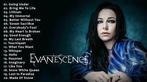
This dark colour scheme is prevelant in various Empire editions. These editions are targeted as teenagers, despite Empire's audience typically being older. This reflects that something about more gothic styles intrigues the young adult generation who read the magazine. This could be because of styles at the time. When Twilight New Moon was released, indie rock was popular. Music artists such as Evanescence and Linen Park dominated the music industry, having a huge influence on western style and behaviour.
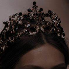
Similarly today alternate styles are still prevalent, with the Gothic style branching out into fashions such as the e-girl fashion and royal core fashion. Media is experimenting more than ever with style. Fashion industries are bringing new ideas to social media. People can express themselves more than ever.
New fashions and aestethics include:
This aesthetic has been adapted into numerous magazines:
Branding techniques of magazines, specifically film.
By using an iconic film figure James Bond but not revealing the context of the new film: No time to Die, the audience is compelled to read on in the magazine in an attempt to find out or see more of their favourite character.
The plug 'Win' gives a sense of reward to the reader: that if they should read this magazine they have the chance of gaining something in return.
The Sans Serif font of ONSCREEN, as used in all their other magazines, makes the masthead recognisable and distinctive but not repetitive as the colour changes. For each magazine ONSCREEN conventionally changes the colour of their font to match the aesthetic of the film/poster. By using the colour scheme of gold, white and black, a sense of not just professionalism but also wealth and quality. This edition of the magazine while appealing to the aspirer male also could appeal to a female audience, since the photo selected of Daniel Craig is mode of address, conventional for attractive, chic James Bond characters.
Once again, ONSCREEN has run a competition. But it is interesting to note that this is for Peter Rabbit Goodies unlike the £100 Cinema voucher up for grabs in the Bond film. This seperates the Bond audience from this edition, though the magazine will still keep the audience who enjoy such movies. It could connote that this edition is catering for a younger audience, since the movie in discussion is Mulan, and that the magazine company does not set a determined audience for its brand, but that the movie decides it.
Here are some example s of gothic front covers and two-page spreads that incorporate themes of crime, action, thriller and romance that I wish to include.


No comments:
Post a Comment