Search My Blog

Saturday 21 October 2023

NEA


STATEMENT OF INTENT:


If you cannot read the text, I have typed out a copy of the statement below:

How do you intend to use the four areas of the media theoretical framework to communicate meaning and meet the requirements of your chosen brief?

 Product 1

For my print products, I intend to use the magazine masthead ‘Fix’ to correspond with the magazine’s memorable sell line: ‘Your Monthly Dosage of Film’. Reminiscent of action movie posters and movie magazines such as Empire, the bold typography I use on the front pages and contents pages will draw in my 16-25 media literate audience and establish brand identity. To conform to Richard Diar’s Star theory, my models will possess a unique and memorable identity and will be facing the camera in direct mode of address. Additionally, to reflect today’s more liberal zeitgeist and broaden representation, I will dress my female model in a masculine costume with ripped jeans and a Gothic oversized t-shirt. On the second cover, my male model will have a feminine touch to his clothing, with a lighter colour scheme to his waistcoat and shirt that will complement longer feminine hair. This means that both genders will be engaged in reading my magazine as they will equally be represented. Furthermore, to fulfil the brief’s requirement for intertextuality and to produce for a media-literate audience, I will include rich intertextual references to films, television, and music such as David Bowie’s 'Ashes to Ashes' and Alicia Key’s 'This Girl is on Fire' across the print products.  

 Product 2 

 On the website, I intend to include articles interviewing movie stars to reflect film journalism conventions. These articles will be rich with content to engage a middle-upmarket explorer audience but will also be accompanied by large photographs of the interviewed stars to hold a younger audiences’ attention. Additionally, to enable different forms of interaction on my website, I will include a 30 second teaser video for an up-and-coming movie release accompanied by a short behind-the-scenes video. To embrace Jenkins fandom theory, I will include competitions on the website and opportunities for film fans to share their views on different cinematic topics. I will also include intertextual references to Shakespearian Literature and the Grimms-Disney fairytale 'Snow White' in an article named ‘Favourite Movie Location Picks’, as I believe a middle-upmarket audience would be familiar with these products. I also intend to use a dark colour scheme for the website to mimic streaming site semiotics, which I encountered during my research, such as Netflix’s black and red aesthetic.

 How do you intend to link your media products to demonstrate your knowledge and understanding of the digitally convergent nature of your media production?

Using the same typography for the masthead and cool, dark colour scheme, I aim to link my media products through establishing a strong, impactful brand identity. The magazine’s sell line, ‘Your Monthly Dosage of Film’, will be represented on the website’s home page and additionally there will be an option to subscribe to the print editions on the website. For digital convergence, I will use a call to action on at least one of my film magazines through placing a QR code on the front cover. As well as inserting the website’s address at the top of each front cover and contents page, the cover stars on each edition will be featured in interviews on the website as a form of synergy. Additionally, the competitions mentioned within the contents pages will be available to enter through a lightbox feature on the website, enabling audience interactivity.


Final Product

MAGAZINE COVER 1:


CONTENTS:


MAGAZINE COVER 2:


CONTENTS 2:


WEBSITE:

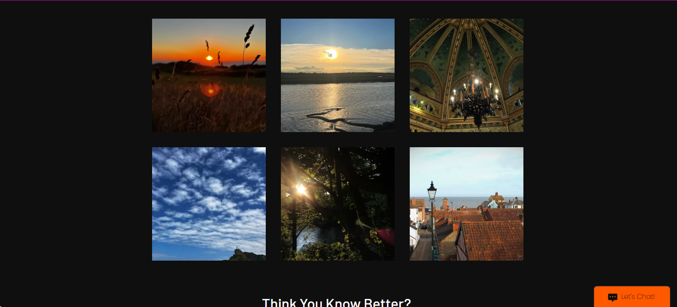
PLEASE EXAMINE THE HOME PAGE AND FEATURES PAGE. THE CONTACTS PAGE IS AN EXTRA PAGE I DECIDED TO MAKE.

Home | Official Flix Mag (angelinaklein373.wixsite.com)

There sometimes is an error with formatting the layout for different devices. If this is a problem for your device, I have attached below what each page is intended to look like:

HOME PAGE:


NOTE - I wanted to add the Stay Informed section to all pages on my website. However the website said that I would have to pay to add additional sections as I already had too many. Despite this, I have managed to place contact details on each page to keep within a consistent framework.

FEATURES PAGE:


EXTRA CONTACT PAGE


Thursday 19 October 2023

Intertextuality and Branding

To engage with the media-literate audience that the brief directs, I have included rich intertextual references in my print and online products. In this blog, I will outline these intertextual references and explain how they interact not only with a media-literate audience but also an ABC1, 16-25 audience demographic.

PRODUCT 1:


1. 'DOWN THE RABBIT HOLE'  - This cover line advertising a psychological thriller movie is referencing Alice in Wonderland. A well-read media literate audience would understand this context.

2. LIFE IN STYLE - HOW ROSS LEADS A NON-CONFORMIST LIFE - This cover line is an intertextual reference to the made-up film that is the subject of the magazine, Obliged to Conform. I have done this to be consistent with the edition theme and enhance a level of verisimilitude.


CONTENTS PAGES:


1. YOU HAD ME AT GOODBYE - This is a spin on the famous movie quote 'You had me at hello' in the 1996 Cameron Crowe romance movie, Jerry Maguire. As it is not the original quote, I thought its connotative meaning would best be deduced by a media-literate audience.

2. IF THE CONVERSE FITS - Reference to a new Cinderella movie.

3. RETURN OF THE SIXTH - MAY THE FOURTH BE WITH YOU - I included these Star War references (Return of the Sith - movie - May the force be with you - famous quote from the movie -) to appeal to the Sci-Fi audience reading my magazine. As Star Wars is a long canon of films, I would expect a readership with a higher attention span to engage with this, fulfilling the middle-up-market class of the brief.

4. GATSBY - Reference to the Great Gatsby. Including content on different movie genres means that audience reach is widened and an elective cinematic range is achieved.

28. WHERE'S MY HAT? - Fun Indiana Jones reference to entertain my media literate audience. 

29. NOBODY PUTS BETTY IN A CORNER - This reference would require a high level of contextual understanding to depict as it is two references in one. It is a spin on the quote: 'Nobody puts Baby in a corner' from Dirty Dancing, but has replaced the subject 'Baby' with a reference to Betty Boop -- a vintage cartoon famous for dancing in episodes.


PRODUCT 2:


1. ASHES TO ASHES - This is an intertextual reference to David Bowie's song Ashes to Ashes and also the BBC Sci-fi drama, Ashes to Ashes. A level of cultural and contextual understanding would be needed to decode this, as it is not only in reference to the pop, New Romantic style of the 1980s, which my model is partially reflecting in her smoked makeup, but also a 2000s TV show which was broadcast on the BBC. Because of this, I would expect a middle-up-market class to engage with the coverline.

2. THIS FILM IS ON FIRE - This coverline references the Alicia Keys song 'This Girl is on Fire'. I have used this to appeal to my younger audience (16-25) as I believe they would be familiar with this piece of music, particularly as it came out in 2012 and was a popular hit.

3. CUPID LOVE - This coverline is a reference to the Greek Mythological character, Cupid. I placed it in as it is relevant to context of the magazine, as it is set to release in February, the month of Valentine.

4. PROMETHEUS - My model's t-shirt is a highly subtle reference to the Gothic genre due to the Mary Shelley novel Frankenstein or the Modern Prometheus. I believe this easter-egg will engage not only a media-literate audience but a well-read ABC1 audience as well.


1. THE FOURTH MUSKETEER - This is an intertextual reference to the French historical adventure novel 'The Three Musketeers' written by Alexandre Dumas and adapted in 2011 and 2023 into film.

2. FAIREST OF THEM ALL - Reference to Grimms Snow White and Disney Snow White. This appeals to a literary audience. 

3. 'WATCH ME DANCE' - This reference reflects the social and cultural context with a quote from Greta Gerwig's Barbie - the biggest movie of 2023. 

4. COLOURS OF THE WIND - This reference to the movie Pocahontas will engage Disney film fans.

5. O BEWARE! - This is a reference to Shakespeare's Othello which a high-brow audience would understand.

6. TIS NOT TO BE: A reference to Shakespeare's Hamlet.

7. JURASSIC PARK: This would engage an explorer audience as it is debating the origin to the movie 'Jurassic Park'.

WEBSITE:


The dark colour scheme on the background to my homepage is reminiscent of the Gothic genre. Additionally, the castle which the photo was taken in is symbolic of the medieval genre in film.


The movie posters for Obliged to Conform, Fire and Silk, and If the Converse Fits are all references to movies that have already been mentioned in the copy of the magazines.


This movie description for the poster 'Unrequited' makes reference to Hans Christian Anderson's 'The Little Mermaid'. A middle-up-market audience who enjoy literature may be able to engage most with this.


This short lightbox description about the editor includes reference to famous actors such as Ryan Gosling and Liam Neeson. This reflects the social zeitgeist and will appeal to avid fans of those celebrities.


The made-up movie title 'The Huntsman' is connotative of the Snow White and Red Riding Hood fairy tale. 


   This article is directly referencing Shakespeare's Twelfth Night. This will appeal to an audience with a knowledge and love for Shakespearean plays. It could also appeal to an explorer audience who want to widen their cultural competency.  


 This acts as an intertextual reference to the movie on the front cover of my second magazine to continue engaging my readership.


BRANDING: 

To meet the brief's requirements for media convergence between products, I have created a recognisable brand and have linked each product to each other through various methods:


Through inserting a link to the website above the sell-line and adding a call to action under the text 'SNEAK PEAK!' I have connected the first edition of my magazine to the online product. The QR code I have inserted will take you directly to  Home | Official Flix Mag (angelinaklein373.wixsite.com)


Additionally, although the colour for the letters have changed for the website, (as I could not insert the black text over a black background), the font has remained the same. The colour scheme of the website also maintains a level of brand identity, with cool black and white colours being reflect. Interestingly the use of a castle setting for the opening homepage could arguably be reminiscent of the medieval style my model is wearing, linking the two in genre.


The movie that is the subject of edition one is consistently referenced throughout the website, with exclusive interviews with the actor Ross Marks, movie posters including information for fans, and location features on the features page. 


There is also a call to action on the website for subscribing to the magazine which is featured in both edition one and two's contents pages. The price is the same on all products, which maintains the convergent element between them.


I have also included a link to the website in the second edition, inserted at the same point of the page in the same typography. 


As well as this I have ensured that the link to the website is included within the boarder of the contents pages for each edition.


Furthermore, I have included the same sell line on each edition and on the website.


These stylistic choices recognisably market my brand. The sophisticated tone to the products attract an upper-mid-market audience and the dark colour schemes with bold typography are reminiscent of the action film genre.

As I did with edition 1, I have also made consistent references to edition 2 throughout the website and the subject movie of the magazine, Fire and Silk. This increases fan interactivity:


FEATURED POST

NEA

http://centralhubsouthendhigh.blogspot.com/ STATEMENT OF INTENT: If you cannot read the text, I have typed out a copy of the statement below...