SELECTING AN IMAGE: EDITION 1
FAVOURITE POTENTIALS:
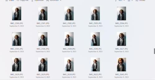
I liked these images due to the way they had come out on the camera. The lighting and tone was perfect for the thematic branding and design I intended to achieve for my NEA. These images, I believe, fulfil the brief's media-literate audience requirement, as I believe the dark, shaded lighting sets a cinematic atmosphere as well as conforming to classic conventions of genres such as action and Gothic. Additionally, I believe the way in which my model is directly addressing the camera, but in some images is not entirely smiling or making a full expression, gives a sense of enigma to the magazine which would attract in an explorer audience.
Mock up front covers:
This mock up front cover was done to follow the guidelines of my pitch, with the title being bold and enticing a media literate audience.
In this mock-up cover, I am experimenting just with the title font. I knew that I wanted to add an outline to the text to make the magazine a bold statement (this is to draw in the attention of my young 16-25 audience) however I was unsure whether or not blue suited the theme I was seeking. Indeed it matched with the cooler deeper tones, but I thought a contrasting warmer tone may fit better.

The editing process
At first I experimented with removing the inside colour of the font and leaving just an outside outline for a bold effect. For an element of verisimilitude, I added in a barcode, and also to encourage interactivity, plotted in a QR code which I later replaced with one generated for the website I created.
The bold movie title 'Obliged to Conform' anchors the image of my model to a movie he is an actor in. The green, calligraphic font acts as a code/symbol to inform readers that this is a magazine about a new and upcoming movie.
In the end, after changing the magazine title from Flix to Fix, I decided on a deep red to outline the font Phosphate on Photoshop. Furthermore, I enlarged the lime green calligraphy font 'OBLIGED TO CONFORM' for maximum audience attention upon looking at the magazine. The colour green was chosen as I felt that it stood out on the page and would draw in an audience even with a shorter attention span (such as a young 16-25 audience) and additionally intrigue film fans.
Experimenting with contents page:
At first I thought that green would fit the editor's note column, as well as a feature on new movies coming out. However, I realised that with the photographs I had taken for new movies, the editor's note would be too tight a squeeze. As having an editor's note is a requirement of the brief, I thought it best that that received the spotlight within the cover pages' margin rather than movies which I could talk about within the contents titles. I also wanted to encourage a level of enigma for my explorer audience, so I took the silhouettes of two models I had photographed and inserted them behind my main model, implying that there is more to his story in the fictional movie 'Obliged to Conform', which he stars in.

Once prioritising the editor's note as a main focal point to the contents page, I changed the margin to a deep mauve colour as I believed this shared more thematic harmony with the red typography. In order to keep an element of green, which would match typography on the front cover, I used the 'Stroke' tool on Photoshop to outline the text 'CONTENTS' in the same lime green.
Since receiving feedback from my teacher, I have added as many contents as I can onto the page and ensured that the alignment of the copy synchronises. I did this through using the ruler tool on photoshop. Furthermore, I changed the editor's image to one I thought looked more professional and also matched the editor's image within my second edition. I formatted the second edition into a JPEG in order to drag it onto the first edition's PSD file; this meant that I could scale it down with the scale tool and insert it beneath the editor's letter for a level of verisimilitude and in-house convergence.
EDITING PROCESS FOR SECOND EDITION -
FAVOURITE POTENTIALS:
I really liked the level of shadows within these images. Not only did the images correspond with edition 1's theme, thus increasing brand identity, but they also had its own enigmatic and unique feel about them. I used costume to create the effect that it was an action film I was advertising, with masculine, unrestrictive clothing such as the Prometheus t-shirt. I also used iconography to communicate meaning: the studded choker, chains, and sharp bracelets all have connotative links to the Gothic and action genre, implying that some sort of danger is within view. This hermeneutic and proairetic coding constructs my magazine into an identifiable form of advertising for cinema as well as a form of entertainment.
Additionally, I made two mock-up covers for the second edition.
.png)
.jpg)
These two photographs I felt appealed to a media-literate audience due to the deep lighting reminiscent of the Gothic Genre. I also liked how these photographs captured the deep makeup in which she was wearing. I have since chosen another picture for the main front cover, but these images were able to inform me of the feel and atmosphere which I wanted to employ for the second edition of Flix/Fix magazine. I have since changed the magazine name to Fix due to it clashing with another student's magazine title.


Once selecting the image I wanted to use, I began experimenting with different font types. I found that the bold inline Phosphate font worked best for the masthead as it had already been used for the first edition (I wanted to keep within an accurate brand identity). Interestingly, I did not want to clash font use for the movie title as I understood different movies (since the magazine is not the producer of the movies) would have different fonts in different colours. At first I played around with script and handwriting font. I knew I wanted it in a bright colour - save from green.

Once removing the background, I could get an easier feel of where I was to place coverlines. I selected the same ariel font as I had used for edition 1's coverlines - I wanted to keep those simple as they were already capitalised. The typography I used for the movie title 'FIRE AND SILK', on the other hand, was a completely different script to 'OBLIGED TO CONFORM'. This was so that readers could differentiate between the two magazines and also to add a level of verisimilitude - each film today has its own unique feel and does not often borrow the same font and font colour as a movie which is being released around the same time. I also added some shading to bring more depth to the image and sharpened details with the sharpen tool on Photoshop which before would have been blurred.

Finally, once ensuring my coverlines were aligned correctly with the ruler tool, I added in a barcode and the price. I also changed the title Flix from Fix and made sure that the sell-line 'Your monthly dosage of film' was a pun that interacted with the title.
CONTENTS PAGES:
Whereas edition 1's cover pages had a white background, I decided to give edition 2 a soft pink background. I did this to reflect the social zeitgeist. Since I, as seen in the image below, add a coverline and a quote from the huge cinematic hit Barbie from 2023, I thought the pink background would appeal to fans of the film. Additionally, the pink colouring brightens the cover pages and draws a deeper contrast with the more stereotypical masculine colours which my second model, Otto, is wearing. Furthermore, the puffed-sleeve outfit which the first model is wearing acts as a foil to the action genre, maximising audience taste. Not only does she reflect the cottagecore fashion trend which is trendy among 16-25 year-olds, but also anchors the meaning to the fairytale puns that perpetuate throughout the coverlines.

Once adding in detailed contents, I enhanced the pages' feminine appeal by using the Photoshop shape tool to insert flower patterns besides the typography 'EXTRAS'. I also ensured the coverline typography matched with edition 1's typography and added in an editor's note. The transparent blending of my model's arm blending behind the text was a technique I achieved through lowering the opacity of different layers.
Finally, I added in more contents to maximise the amount of copy for my ABC1 readership. I believed that this amount of text would not intimidate a young 16-25 audience who had middle-up-market backgrounds as they would be used to reading in greater quantities. Additionally, the bold typography and bright colouring acts in aid of capturing a secondary audience's short term attention span.
ADDITIONAL IMAGES I TOOK FOR WEBSITE AND MAGAZINE:


.png)
.jpg)


