To engage with the media-literate audience that the brief directs, I have included rich intertextual references in my print and online products. In this blog, I will outline these intertextual references and explain how they interact not only with a media-literate audience but also an ABC1, 16-25 audience demographic.
PRODUCT 1:
1. 'DOWN THE RABBIT HOLE' - This cover line advertising a psychological thriller movie is referencing Alice in Wonderland. A well-read media literate audience would understand this context.
2. LIFE IN STYLE - HOW ROSS LEADS A NON-CONFORMIST LIFE - This cover line is an intertextual reference to the made-up film that is the subject of the magazine, Obliged to Conform. I have done this to be consistent with the edition theme and enhance a level of verisimilitude.
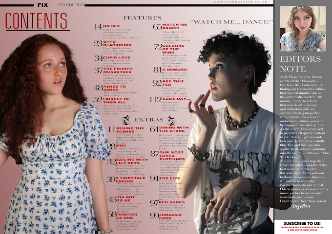
CONTENTS PAGES:
1. YOU HAD ME AT GOODBYE - This is a spin on the famous movie quote 'You had me at hello' in the 1996 Cameron Crowe romance movie, Jerry Maguire. As it is not the original quote, I thought its connotative meaning would best be deduced by a media-literate audience.
2. IF THE CONVERSE FITS - Reference to a new Cinderella movie.
3. RETURN OF THE SIXTH - MAY THE FOURTH BE WITH YOU - I included these Star War references (Return of the Sith - movie - May the force be with you - famous quote from the movie -) to appeal to the Sci-Fi audience reading my magazine. As Star Wars is a long canon of films, I would expect a readership with a higher attention span to engage with this, fulfilling the middle-up-market class of the brief.
4. GATSBY - Reference to the Great Gatsby. Including content on different movie genres means that audience reach is widened and an elective cinematic range is achieved.
28. WHERE'S MY HAT? - Fun Indiana Jones reference to entertain my media literate audience.
29. NOBODY PUTS BETTY IN A CORNER - This reference would require a high level of contextual understanding to depict as it is two references in one. It is a spin on the quote: 'Nobody puts Baby in a corner' from Dirty Dancing, but has replaced the subject 'Baby' with a reference to Betty Boop -- a vintage cartoon famous for dancing in episodes.
PRODUCT 2:
1. ASHES TO ASHES - This is an intertextual reference to David Bowie's song Ashes to Ashes and also the BBC Sci-fi drama, Ashes to Ashes. A level of cultural and contextual understanding would be needed to decode this, as it is not only in reference to the pop, New Romantic style of the 1980s, which my model is partially reflecting in her smoked makeup, but also a 2000s TV show which was broadcast on the BBC. Because of this, I would expect a middle-up-market class to engage with the coverline.
2. THIS FILM IS ON FIRE - This coverline references the Alicia Keys song 'This Girl is on Fire'. I have used this to appeal to my younger audience (16-25) as I believe they would be familiar with this piece of music, particularly as it came out in 2012 and was a popular hit.
3. CUPID LOVE - This coverline is a reference to the Greek Mythological character, Cupid. I placed it in as it is relevant to context of the magazine, as it is set to release in February, the month of Valentine.
4. PROMETHEUS - My model's t-shirt is a highly subtle reference to the Gothic genre due to the Mary Shelley novel Frankenstein or the Modern Prometheus. I believe this easter-egg will engage not only a media-literate audience but a well-read ABC1 audience as well.
1. THE FOURTH MUSKETEER - This is an intertextual reference to the French historical adventure novel 'The Three Musketeers' written by Alexandre Dumas and adapted in 2011 and 2023 into film.
2. FAIREST OF THEM ALL - Reference to Grimms Snow White and Disney Snow White. This appeals to a literary audience.
3. 'WATCH ME DANCE' - This reference reflects the social and cultural context with a quote from Greta Gerwig's Barbie - the biggest movie of 2023.
4. COLOURS OF THE WIND - This reference to the movie Pocahontas will engage Disney film fans.
5. O BEWARE! - This is a reference to Shakespeare's Othello which a high-brow audience would understand.
6. TIS NOT TO BE: A reference to Shakespeare's Hamlet.
7. JURASSIC PARK: This would engage an explorer audience as it is debating the origin to the movie 'Jurassic Park'.
WEBSITE:
The dark colour scheme on the background to my homepage is reminiscent of the Gothic genre. Additionally, the castle which the photo was taken in is symbolic of the medieval genre in film.


No comments:
Post a Comment